Welcome to the HDAdvisors blog! This is where we’ll share insights on affordable housing trends, policy research, and data visualization.
Example R Code
Code
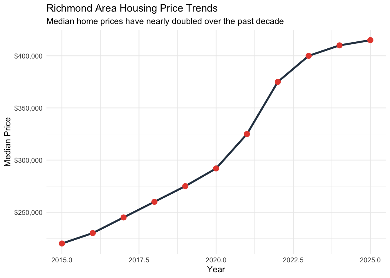
library(ggplot2)library(dplyr)# Sample data - replace with your actual datahousing_data<-data.frame( year =2015:2025, median_price =c(220000, 230000, 245000, 260000, 275000, 292000, 325000, 375000, 400000, 410000, 415000))# Create a visualizationggplot(housing_data, aes(x =year, y =median_price))+geom_line(color ="#2C3E50", size =1.2)+geom_point(color ="#E74C3C", size =3)+scale_y_continuous(labels =scales::dollar)+theme_minimal()+labs( title ="Richmond Area Housing Price Trends", subtitle ="Median home prices have nearly doubled over the past decade", x ="Year", y ="Median Price")
Example visualization
Source Code
---title: "Housing Starts"description: "An introduction to our new blog"date: "2025-05-10"categories: [affordable housing, Richmond]image: "images/rva_logo.png" # Add an image to this directory if desired---Welcome to the HDAdvisors blog! This is where we'll share insights on affordable housing trends, policy research, and data visualization.## Example R Code```{r}#| label: example-plot#| fig-cap: "Example visualization"#| warning: falselibrary(ggplot2)library(dplyr)# Sample data - replace with your actual datahousing_data <-data.frame(year =2015:2025,median_price =c(220000, 230000, 245000, 260000, 275000, 292000, 325000, 375000, 400000, 410000, 415000))# Create a visualizationggplot(housing_data, aes(x = year, y = median_price)) +geom_line(color ="#2C3E50", size =1.2) +geom_point(color ="#E74C3C", size =3) +scale_y_continuous(labels = scales::dollar) +theme_minimal() +labs(title ="Richmond Area Housing Price Trends",subtitle ="Median home prices have nearly doubled over the past decade",x ="Year",y ="Median Price" )```